
Email Metrics Dashboard: Build One That Drives Action
Build an email metrics dashboard that turns opens, clicks, replies, and bounces into clear next steps. Covers KPIs, design, and Gmail-friendly options.
You’re staring at a Gmail inbox that keeps moving, and the hardest part isn’t sending the next message, it’s deciding which thread deserves it. One contact has opened twice and gone quiet, another hasn’t clicked, and a third might be buried under a dozen newer tasks. That’s where an email metrics dashboard earns its keep, not as a monthly report, but as the screen that tells you whether to follow up now, wait, or move on.
Most public dashboards still feel built for marketing teams chasing volume. Gmail-based senders need something sharper, a control panel that turns opens, clicks, replies, and bounces into a decision you can make in seconds. The test isn’t whether the chart looks polished, it’s whether the dashboard helps a salesperson, recruiter, or freelancer avoid a bad follow-up at the worst possible time.
The Moment an Email Metrics Dashboard Was Built For
A sales rep opens Gmail on a Monday morning and sees twenty unread threads, each with a slightly different flavor of urgency. One prospect looked engaged last week, one recruiter candidate hasn’t replied, and one client opened the proposal but hasn’t said a word since. The inbox is full, but the signal is thin.
That’s the moment a good email metrics dashboard is built for. It doesn’t exist to celebrate last month’s totals, it exists to answer a live operational question, and that question is usually some version of, should I follow up now, wait, or move on.
The problem is that raw email activity doesn’t tell you which thread matters most. A message can be delivered and still ignored, opened and still not read carefully, or clicked and still not produce a reply. The metrics are easy to count, but the meaning behind them gets muddy fast when teams rely on one number and call it insight.
Practical rule: if a dashboard can’t help someone choose the next email to send, it’s not a working dashboard, it’s decoration.
That’s why the best inbox dashboards feel closer to a dispatch screen than a marketing report. They separate simple reach from true engagement, then add timing so the sender can act while the thread still has momentum. Public dashboard examples usually miss that urgency, because they start from campaign reporting instead of the sender’s next move.
The rest of the design choice flows from that one shift. Once the dashboard is built around the decision, the useful metrics become obvious, and the vanity ones become easy to leave out.
Defining an Email Metrics Dashboard From First Principles
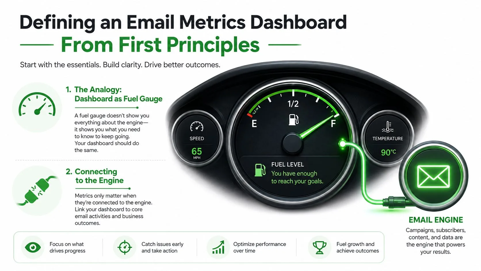
A dashboard is useful only when it connects the thing you’re watching to the thing you can control. In email terms, that means the screen has to reflect the actual sending system, the tracking model, the time window you care about, and the layout that makes a decision obvious.
A car dashboard offers a useful comparison. A fuel gauge is valuable because it connects to the engine you’re driving, not because it looks technical. An email metrics dashboard works the same way, it translates the inbox into a few indicators you can scan without stopping to calculate anything.
The Analogy That Actually Holds Up
The word dashboard gets used for everything from a pretty chart page to a genuine operational control panel. The difference is simple. A real dashboard helps you act, while a chart collection just helps you look informed.
For Gmail-based sending, the core building blocks are clear:
- A data source, which is where the events come from.
- A metric model, which decides what counts as an open, click, reply, or bounce.
- A time window, because daily review and monthly review answer different questions.
- A visual layout, which decides what the eye sees first.
That structure matters because one-to-one email behaves differently from newsletter marketing. Message-level engagement is what a sender needs when the goal is a reply, a meeting, or a hiring response. Aggregate campaign metrics still matter, but they’re only useful if they lead back to a specific thread.
What Belongs on the Screen
A dashboard belongs to the question of action, not the vanity of coverage. If the view is full of charts but doesn’t tell you which email to touch next, it’s too broad. If it only shows a single open number, it’s too shallow.
A useful layout keeps the primary view small and focused, then lets the user drill into detail when needed. That’s why the fuel-gauge analogy works so well, it forces the design to stay attached to something that can run low, stall, or overheat.
The Core Metrics and What They Actually Mean
The strongest dashboards start with the same small set of operational fields, open rate, click-through rate, bounce rate, unsubscribe rate, and conversion tracking, with broader executive views often adding deliverability, spam complaints, list growth, ROI, and revenue-per-email, as called out in dashboard guidance from Benchmark Email and Salesforce, and in executive metric guidance from ThoughtSpot. Those are the fields that turn a pile of sends into a small control panel.
Open Rate Is a Signal, Not the Verdict
Open rate tells you whether a delivered message appears to have been seen, but it’s a weak proxy for actual attention. It’s calculated on successful deliveries, not total sends, so delivery quality changes the denominator and makes comparisons tricky when inbox placement shifts. Salesforce’s performance view also places open rate, click rate, unsubscribe rate, and a performance funnel together, which is the right instinct because one number never explains the whole thread.
That’s also why the idea of “success” gets overstated when people stare at opens alone. A message can be opened and still fail to move the conversation forward. For a Gmail user, open rate is most useful as a quick diagnostic, especially when paired with bounce and click data.
Clicks, Replies, and Timing Tell the Better Story
Clicks are stronger evidence of intent than opens because they show the recipient did something with the message. Replies are stronger still for sales, recruiting, and client outreach because they represent actual business movement. Timing metrics matter too, because a fast open with no click can mean curiosity, while a delayed open can mean the thread was seen only after the moment passed.
If you want a broader framework for that kind of practical measurement, the guide to performance profiling is a useful mental model because it treats the number as a clue, not an ending.
What to Keep Daily, Weekly, and Monthly
Daily views should stay lean. Open counts, click-through, replies, bounces, and obvious anomalies deserve the main screen because they affect the next move.
Weekly review should absorb trends, segment comparison, and send-time patterns. Monthly reporting can hold the bigger picture, the slower attribution questions, and anything that needs a wider sample before it means much.
For a quick reference on open-rate reporting in a Gmail context, the internal open rate feature guide is where the tracking logic belongs, not in your main decision screen.
Where the Data Comes From and How to Validate It
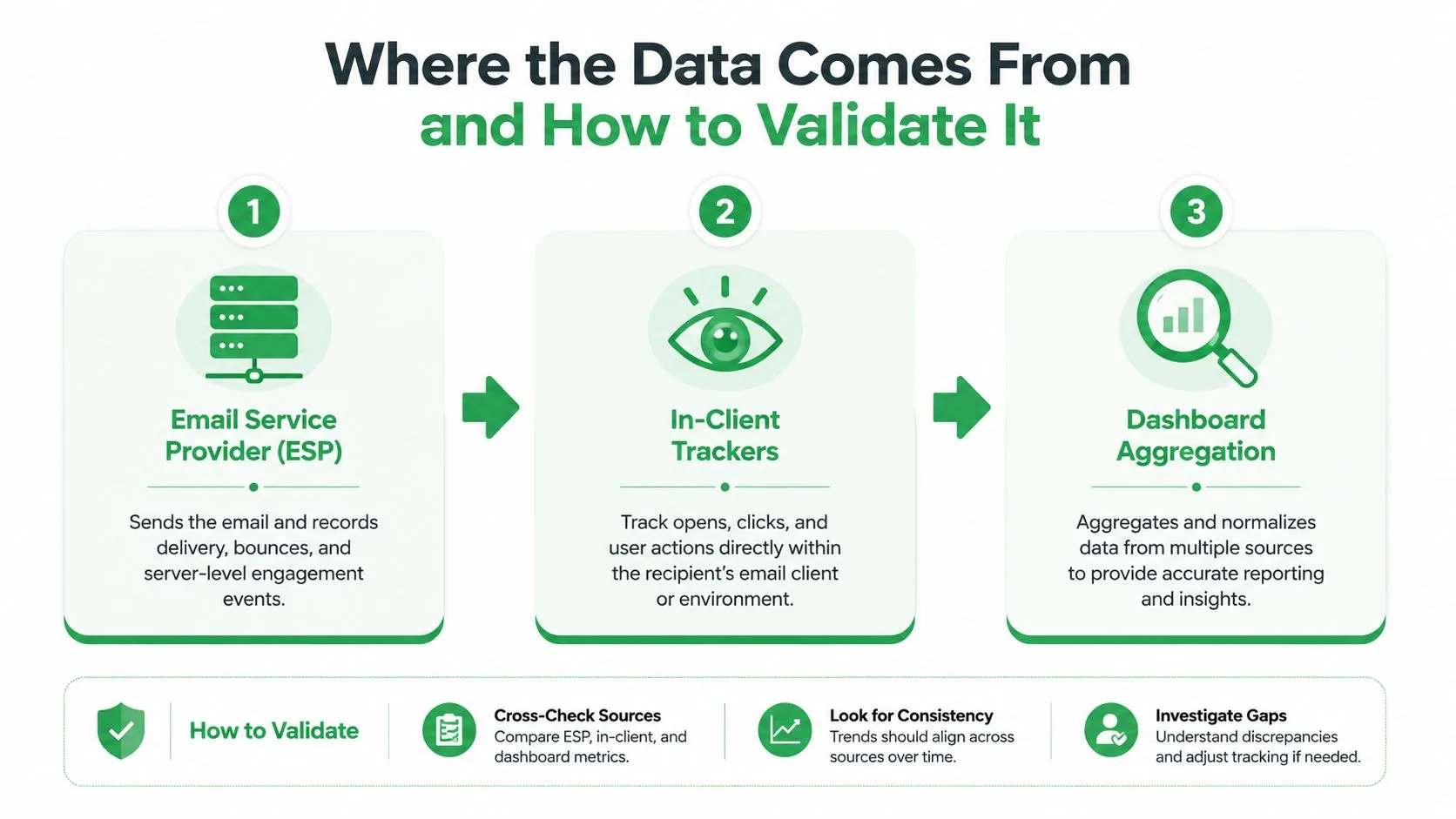
Most dashboard trust problems start before the first chart loads. The same open count can differ between systems because each layer sees the event through its own rules, and those rules are rarely documented well enough for busy teams.
Three Layers, Three Jobs
The sending platform or ESP is the source for delivery, bounce, and send status. In-Gmail trackers such as Mail Tracker for Gmail live closer to the sender’s daily workflow, so they’re better for immediate visibility inside the inbox. CRM, calendar, and BI tools are where replies, meetings, and revenue attribution usually end up, which makes them better for downstream business context.
That split is why one source of truth matters. Delivery data should come from the sender, response data should come from the place where replies are captured, and meeting data should come from the calendar or CRM. Tying every KPI to the wrong system creates endless arguments over whose number is “correct.”
When the same metric is owned by three tools, nobody trusts the dashboard for long.
Governance Beats Guessing
Metric governance sounds tedious, but it’s the only way to keep a dashboard honest. One owner per KPI avoids the common mess where marketing, sales, and ops each maintain a slightly different version of the truth. Monthly audits catch the drift that happens when tagging changes, UTM conventions break, or CRM latency starts hiding real outcomes.
That audit doesn’t need to be fancy. Check whether records are duplicated, whether links are still tagged the same way, whether opportunity links are missing, and whether the send platform and CRM still agree on the same thread. That’s the difference between a dashboard that ages well and one that slowly becomes theater.
What Each Layer Is Good At
The ESP knows what left the system. The inbox tracker knows what happened in the sender’s immediate view. The CRM knows what turned into pipeline, a scheduled conversation, or a closed deal.
If you want the Gmail-side tracking layer documented more fully, the email tracking for Gmail overview is the right place to connect the inbox event to the dashboard layer. Use it as the middle piece, not the whole architecture.
Designing a Dashboard People Actually Look At
A dashboard gets ignored when it asks the user to think too hard before acting. The cleanest layouts group by question, not by metric, so the eye lands on the answer faster.
Layout Rules That Keep the Screen Usable
Start with the leading indicators near the top, then place the lagging outcomes below them. Put the most important tiles in the primary view, and resist the urge to fill every corner just because the dashboard software allows it. In practice, once the first screen starts behaving like a report archive, people stop checking it every day.
Use the visual that matches the question. Sparklines are good for trend, heatmaps are good for send-time analysis, and small multiples are good for comparing segments without forcing every line into the same chart. Donut charts and 3D visuals usually add noise, not clarity.
One Dashboard, Different Roles
A sales rep needs reply velocity and open streaks, because speed changes the outcome of the thread. A recruiter needs candidate response time, since a late reply can mean the person accepted another offer elsewhere. A customer success manager needs to see engagement drops tied to health risk, and a freelancer needs nudges around invoices and client follow-through.
That’s why the same underlying data should produce different views. The dashboard isn’t “one size fits all,” it’s one data model serving several decisions.
A Useful External Reference
If you’re thinking about how email metrics connect to broader revenue reporting, track marketing ROI in 2026 is a helpful example of how executives tend to frame the same data differently. That’s the right kind of comparison to borrow, because it keeps the dashboard tied to business action instead of chart quantity.
The best screen is still small enough to scan in a few seconds. Once the layout starts demanding a meeting to interpret, the design has gone too far.
Choosing How to Build It Without Overbuilding
The right build depends on volume, team size, and how many systems need to agree with each other. A simple setup is often enough, and overbuilding too early usually creates more maintenance than insight.
Three Practical Paths
Gmail-integrated tracking works well for individual senders and small teams who live inside the inbox. A tool like Mail Tracker for Gmail fits that pattern because it keeps read receipts, open counts, timestamps, and notifications inside Gmail instead of pushing people to a separate reporting app.
A spreadsheet or lightweight template makes sense when volume is still modest and the goal is visibility, not automation. It’s cheap to maintain, easy to audit, and usually enough if the team only needs a quick view of what’s happening across a few hundred or a few thousand sends.
A BI tool such as Looker, Power BI, or Metabase becomes more useful once multiple data sources need to reconcile and more than a handful of people depend on the same numbers. That’s where governance starts to matter more, because the dashboard has to survive different definitions, permissions, and latency windows.
The Point Where Each Option Breaks
The inbox-native option breaks when multiple people need standardized reporting. The spreadsheet breaks when manual cleanup eats too much time or the team wants alerts instead of checks. The BI layer breaks, ironically, when the underlying data isn’t clean enough to deserve that much sophistication.
Before adding tools, make sure the basics are in order. The sender platform, reply capture, and CRM need consistent tags, consistent ownership, and a shared definition of what a “real” response is.
Start with the smallest system that still answers the follow-up question correctly.
One Practical Reference Point
If you want a broader view of dashboard design and business reporting patterns, the guide to local email lead gen is useful context because it shows how reporting changes once email is tied to specific outreach outcomes. Use that lens before you add complexity you don’t need.
Accuracy, Privacy, and the Numbers You Should Not Trust Yet
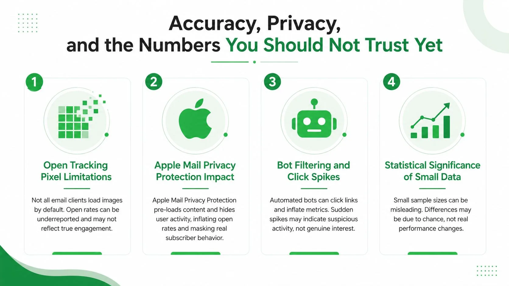
The biggest dashboard mistake is treating every tracked event as equally trustworthy. Email tracking is useful, but it’s not perfect, and the safest dashboard is the one that admits where the numbers are soft.
The Limits of Open Tracking
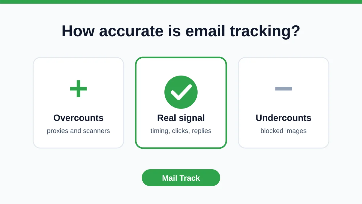
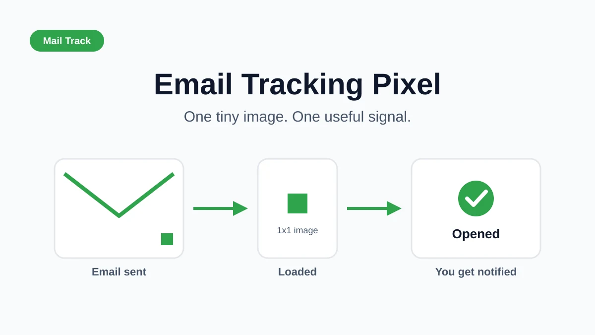
Open tracking pixels only tell you that an image request happened, not that a person read, understood, or cared about the message. Apple Mail Privacy Protection also distorts open behavior, which is why modern dashboard guidance treats open rate as a weaker signal than clicks, replies, and complaint data. That shift is especially important for Gmail users who want to make a real follow-up decision, not just admire a high open count.
Bot filtering creates another trap. A metric can spike or collapse because automated systems touched the email, not because a human changed behavior. That’s why any dashboard that relies heavily on opens needs a clear caution label.
Privacy Needs to Be Part of the Design
Mail Tracker for Gmail documents GDPR compliance statements and user data rights, including access, correction, and removal, and it also notes a choice between a visible tracking signature on the free plan and an invisible tracker on Premium. That matters because not every recipient reacts the same way to tracking, and the dashboard should reflect that reality instead of pretending it doesn’t exist. For the privacy side of the product conversation, the GDPR email compliance guide is the relevant reference.
What Deserves Hero Placement
Only metrics that are both actionable and reasonably stable should get the biggest visual weight. Replies, meetings, deliverability, and complaint signals usually deserve more trust than raw opens, especially when the sample is small or the client mix is uneven.
Here’s the simple filter I use:
- Show prominently: metrics that change the next action.
- Show cautiously: metrics affected by client behavior, tracking quirks, or privacy tools.
- Mark as approximate: anything that looks precise but depends on messy attribution.
If a number can be gamed by the measurement method itself, the dashboard needs to say so out loud.
Turning the Dashboard Into Daily Action
A dashboard only works if it changes behavior on a regular schedule. The easiest way to make that happen is to turn it into a ritual instead of a report.
Three Habits That Stick
Do a two-minute morning review of open streaks and reply velocity. That gives you a fast read on which threads are warm enough to touch and which ones have already gone cold. Use the weekly check to compare segments, subject lines, and send times, because pattern shifts show up there before they show up in revenue.
Reserve the monthly review for source-of-truth assignments and CRM latency. That’s when you catch the slow data problems that erode trust over time.
A Quick Trust Checklist
Before you rely on the dashboard, verify these twelve items:
- Delivery data comes from the sending platform.
- Reply data comes from a tagged inbox or classifier.
- Meeting data comes from the calendar or CRM.
- Open counts are defined the same way across tools.
- Bounce handling is consistent.
- Tagging follows one naming convention.
- UTM parameters aren’t drifting.
- Duplicates are being removed or merged.
- CRM latency is documented.
- Segment logic is stable.
- Alert thresholds are still relevant.
- Ownership for each KPI is clear.
If you need a practical reference for applying that discipline to prospecting and follow-up, the Polaris guide to local email lead gen is a good reminder that reporting only matters when it changes the next outreach decision.
A dashboard is never finished. It gets sharper when the team gets busier, the inbox gets noisier, and the old assumptions stop working.
If you want a Gmail-native way to see opens, timestamps, and message-level activity without leaving the inbox, Mail Tracker for Gmail gives you that tracking layer inside the workflow you already use. It fits this dashboard model because it surfaces the events that help you decide whether to follow up now, wait, or move on.
Ready to track your emails?
Add Mail Track for Gmail from the Google Workspace Marketplace and know the moment your emails are opened. Free and unlimited.
Add to GmailMore reading
More from Guides
How Accurate Is Email Tracking? What Opens Really Tell You
How accurate is email tracking in Gmail? Learn why opens get overcounted or missed, how to spot false opens, and which signals to trust before you follow up.
Email Tracking Pixel: How It Works, How to Spot One and Where It Falls Short
What is an email tracking pixel, how does it show an open in Gmail, how can you find one, and why Gmail and Apple Mail proxies limit what it can tell you.

7 Example Email Accept Job Offer Templates
Use these 7 example email accept job offer templates for formal, concise, and enthusiastic replies, with subject lines, clauses, and sending tips.