
What Is an Email Signature? Key Elements and Best Practices
Discover what is an email signature, its key elements, examples, and best practices to create professional, clear emails in 2026.

You probably don’t think much about your email signature until someone replies with, “Who should I call?” even though your number was sitting right below your name the whole time. That tiny block at the bottom of your message is easy to ignore, but it shapes how people recognize you, how quickly they can reach you, and how polished you look in a busy inbox.
A good signature is more than a digital closing line. It works like a nameplate, a contact card, and a small branding space all at once, and in some teams it even becomes a place for tracking and follow-up signals. The tricky part is that the same block can help you look organized or make you seem cluttered, depending on what you include and how you format it.
The Familiar Block Most People Scroll Past
You’ve probably sent an email, then watched the recipient ask for the exact detail already sitting in your signature. That moment feels minor, but it shows how often people skim past the bottom of a message even when the information is useful.
An email signature is the standardized block that gets appended to outgoing messages automatically, rather than something you type from scratch every time. In plain terms, it’s the identity card your email client attaches for you, usually carrying your name, job title, company, and contact details instead of message content itself, as described in the Sequenzy email signature glossary.
Why this little block matters
A good email signature works like the label on a desk drawer or the card you hand someone at the end of a meeting. It doesn’t carry the whole conversation, but it tells the other person who you are and how to continue the relationship.
Practical rule: a signature should help the reader answer three questions fast, who sent this, what do they do, and how can I reach them?
That’s why the best signatures feel invisible when they’re done well. They don’t interrupt the email body, but they reinforce identity every time a message is opened, forwarded, or revisited.
For readers asking what is an email signature in the simplest possible way, the answer is this, it’s the repeating identity block at the end of an email. Once you understand that, it becomes easier to judge whether a signature is helpful, noisy, or somewhere in between.
Defining the Email Signature and Its Core Elements
An email signature is easiest to understand when you stop treating it like a free-form sign-off and start treating it like a structured component. It’s usually configured once in an email client, then added automatically to messages, which is why it behaves more like a preset label than a handwritten closing line.
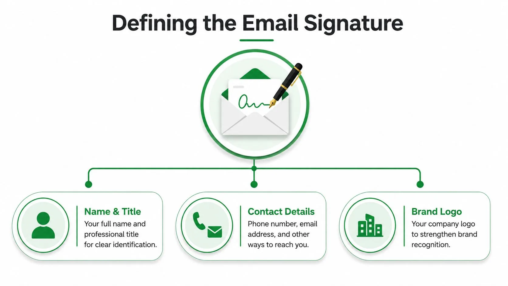
At minimum, professional guidance points to the same core fields again and again, your full name, job title, company affiliation, and at least one direct way to reach you. Dartmouth’s email signature guidance specifically calls for your name, title, department, and phone number, while broader business guidance emphasizes a direct contact method beyond email, which helps the recipient know exactly who they’re dealing with and how to respond.
The main pieces you’ll usually see
A signature often starts with the sender’s name, sometimes set in a slightly larger or bolder style, followed by the role and company. HubSpot describes a typical signature as a compact block of 4–6 lines with those details arranged in a readable stack, which matches the way professional contact information is expected to appear in an inbox. You can see that pattern in the HubSpot professional email signature guide.
After that, many signatures add one or two optional elements:
- Contact details: phone number, email address, office location, or a direct calendar link.
- Branding: a company logo, color accent, or department name.
- Personal identifiers: pronouns, certifications, or social links when they’re relevant to the role.
A useful analogy is a conference badge. The badge has your name and role in front, practical contact information nearby, and maybe a logo or visual cue that tells people where you work. The signature plays the same role in email, just in a format that has to survive different clients, screens, and forwarding habits.
That structure matters because it gives you a way to evaluate any signature you see. If the name, role, and contact path are clear, you’re looking at the core of the feature. If those basics get buried under decoration, the signature has stopped doing its job.
Good vs Bad Signatures and Why the Difference Matters
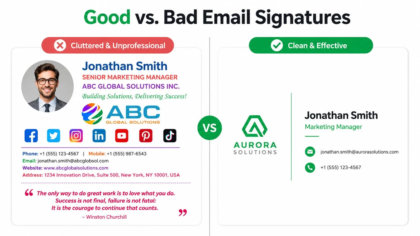
A weak signature usually tries to do too much at once. It may include a huge logo, several social icons, a slogan, a quote, and multiple links, while the name and title get lost in the noise. On a phone or in Outlook, that kind of layout can break into a messy stack that feels more like an ad banner than a contact block.
HubSpot’s description of a typical signature, a compact block of 4–6 lines with the sender’s name first, points to the opposite approach, short, readable, and easy to scan at a glance. The point isn’t to remove personality, it’s to make sure the useful details still show up cleanly in Gmail, Outlook, and mobile inboxes.
Side by side, the difference is obvious
A cluttered version often signals one of two things, poor attention to detail or over-eager self-promotion. A cleaner version does something more subtle, it makes the sender seem easier to trust because the structure feels deliberate.
A signature should add clarity, not force the reader to decode a mini poster.
Here’s the line-by-line difference in plain language. The weak version layers too many colors and links into a small space, while the strong version keeps the hierarchy calm and lets the sender’s name, role, and contact methods do the work. That calmness matters because it helps the signature feel like part of the message, not a separate promotion attached to it.
The same logic applies to visual branding. A single logo can reinforce recognition, but a large or crowded treatment can push the content below the fold and make the sender look less careful. Good signatures are not empty, they’re edited.
Practical Design Rules That Keep Signatures Clean
A signature isn’t a mini billboard, it’s a compact UI element that has to survive different mail apps, screen sizes, and rendering quirks. That’s why practical guidance focuses on compatibility limits, not just style preferences. Expert checklists recommend 4–7 lines of text, a height around 80–150 px for compact designs, and individual images kept under 30 KB so the signature stays lightweight and doesn’t crowd the message body, according to siggen.dev’s best practices.
Build for the inbox, not for a mockup
Keep the width conservative. Independent design guidance recommends a full signature container of about 600 px wide and a total weight near 50 KB so the layout loads quickly and doesn’t break in common clients, as outlined in SyncSignature’s specs and facts guide. That advice matters because Gmail, Outlook, and mobile apps don’t all render the same way.
Choose image formats carefully. The same guidance recommends PNG and JPEG as the safest cross-client options, while WebP, AVIF, and SVG are less reliable across major inboxes. It also notes that exporting images at 2x the rendered size helps keep logos and headshots sharp on Retina and other high-DPI screens without changing the visible dimensions.
Keep the layout simple enough to survive forwarding
Use inline CSS, responsive widths, and strong contrast so the block stays readable when messages are forwarded, quoted, or viewed on smaller screens. If you want a mobile-first framing for email layout more broadly, Victoria OHare’s mobile-friendly email guide is a useful companion read.
If a signature looks fine only in one client, it’s not finished.
That’s also where deliverability and readability overlap. Oversized or image-heavy signatures can make emails heavier, more awkward to render, and more likely to lose their neat structure in smaller clients. If you’re troubleshooting messages that feel off in inboxes, the broader issue might be the signature block itself, not just the email body. A practical reference on sending issues is how to remove email from spam.
Legal, Compliance, and Privacy Considerations
Many businesses place a confidentiality notice or legal disclaimer in the signature because email often moves sensitive information without much friction. That footer isn’t there for decoration, it’s there to reduce risk, clarify responsibility, or satisfy internal policy when a message leaves the company.
The important distinction is between required legal content, useful identity details, and optional promotional extras. Your name and role support trust. A certification or pronoun can add clarity. A marketing banner, on the other hand, should be treated as a separate choice, not something that automatically belongs in every signature.
What to include and what to keep separate
A compliance-heavy signature can feel dense if it tries to carry too much. Recipients usually want the sender’s real name, role, and organization first, then any legal notice if the company requires one. If the block turns into a wall of text, the practical information becomes harder to notice, which defeats part of the purpose.
For GDPR-related questions and how personal data should be handled in email workflows, this GDPR email compliance guide is worth keeping nearby. It’s especially useful if your team operates across regions or handles client data in routine correspondence.
That balance matters because signatures are read by humans, not policy engines alone. A clear sign-off makes the message feel accountable, while a bloated footer can make the sender seem harder to reach. The safest habit is to follow employer-mandated wording exactly, then personalize only the parts that don’t create legal or privacy issues.
Tracking Signatures and Read Receipts in Gmail
Some senders now use the signature layer for something beyond identity, they use it to signal or support tracking. A visible tracking signature tells the recipient that the message is being tracked. An invisible tracker keeps that invisible while the sender gets open notifications in the background.
Mail Tracker for Gmail is one example of how that works inside the inbox. It integrates directly into Gmail, adds double check marks and open counts in the interface, supports a visible tracking signature on the free plan, and offers an invisible option on Premium. It also states that it does not read email content, and records open events instead, which matters for users who want engagement signals without adding a separate workflow.
Where tracking fits into real communication
The signature stops being only a static block and starts acting like part of a communication system. Sales, recruiting, and client-facing teams often want to know whether a message was opened, and Gmail read-receipt tools give them that signal inside the inbox rather than in a separate dashboard.
For a deeper look at the Gmail-specific mechanics, this guide on Gmail read receipts is a practical next step. It helps explain why some teams prefer explicit tracking notices, while others prefer quieter signals in line with their communication norms.
The recipient’s perspective still matters. A visible notice can feel transparent, while an invisible tracker may be less obvious to the reader, so each team has to weigh clarity, comfort, and the norms of the audience. The key idea is that tracking and signatures now overlap, especially in Gmail, where the bottom of an email can carry both identity and engagement signals.
A Short Checklist to Upgrade Your Signature Today
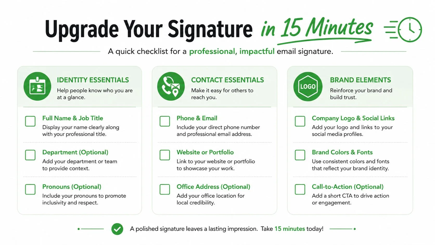
Start with identity essentials, your full name, job title, and company. Then add contact essentials, one reliable phone number and one email address or direct booking link. If your role needs it, include brand elements like a logo or a social profile, but keep them secondary to the contact details.
Use the same standard for every message unless your role needs separate internal and external versions. Microsoft Outlook supports multiple signatures for different contexts, and that flexibility is useful when one format won’t fit every audience. Mailmodo’s 2026 survey also found that 44.4% of users refresh their signatures every six months or less, while 31.6% update them only once every few years, which is a good reminder that signatures are often forgotten after setup, according to Mailmodo’s email signature statistics.
Review it when your title changes, your number changes, or your branding changes.
If you’re adding tracking, decide whether the notice should be visible or invisible based on your audience and your internal policy. That small choice affects how the message feels on the receiving end, especially in sales and outreach contexts.
If you want to see how tracked opens, double check marks, and Gmail-based follow-up signals work together in one inbox, visit Mail Tracker for Gmail. It’s built for people who want read receipts without leaving Gmail, and it fits naturally into the same signature space this article has been about.
Ready to track your emails?
Add Mail Track for Gmail from the Google Workspace Marketplace and know the moment your emails are opened. Free and unlimited.
Add to GmailMore reading
More from Tips
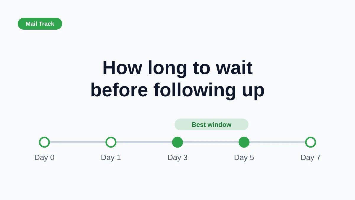
How Long to Wait Before Following Up on an Email (With Tracking Signals)
How long to wait before following up on an email? Use these waiting windows by situation, plus open and click signals in Gmail to time each follow-up.

10 Email Communication Best Practices for Professionals
Master email communication best practices with actionable tips on subject lines, send timing, personalization, and Gmail open tracking for higher engagement.

10 Best Practices Sales Teams Can Use in Gmail
Explore 10 best practices sales teams can apply in Gmail, from subject lines and cadence to personalization, open signals, metrics, and privacy.